
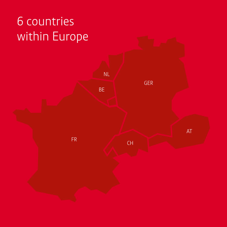
Shaping progress sustainably with a new guiding principle
In 2021, the Westfalen Group developed a new guiding principle to position itself for the future. According to the theme “We are making progress sustainable”, the family-owned company has defined the contents and topics that will define
the Westfalen Group of the future.
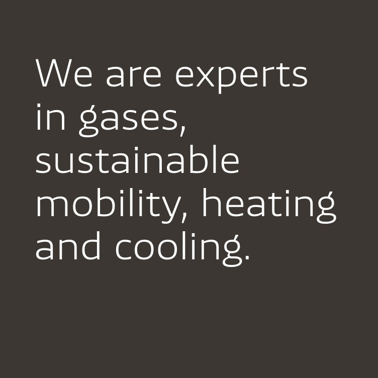
The family-owned company is increasingly relying on the expertise it has built up
over the past 100 years. As an independent European solutions provider, it wants
to take on challenges, to design the markets with innovations and convincing
performances and to continue growing profitably. The focus remains on the
customer and his needs.
The transformation will be approached in an ecologically as well as economically
sustainable manner. The Westfalen Group has always thought in terms of
generations rather than quarters and is increasingly focusing on sustainable
business models.
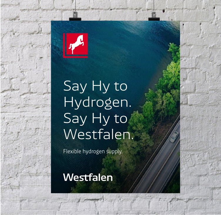
To visualise the new positioning, the corporate design is adapted, too. The
colourful modern and digital design leads the way to a sustainable future. All
media will be converted successively in the coming months.
Experience more about the new guiding principle and a first glimpse of the new
design in the annual report 2021.
Read moreminimize
Annual Report 2021New brand identity combines tradition and modernity
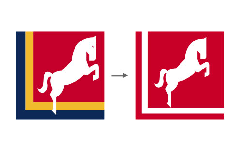
Old vs. new logo
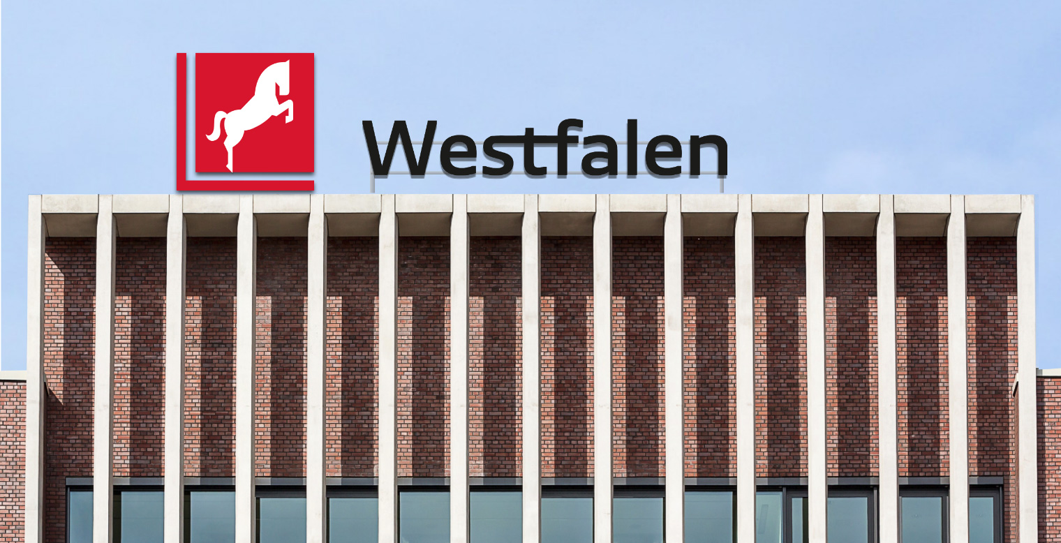
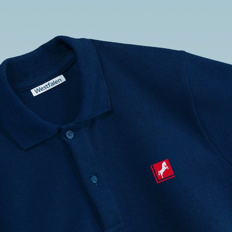
The new logo strengthens the essential elements of the visual identity: the steed, the red colour, the square and the angle.
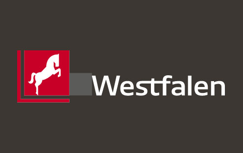
Figurative- & Word mark
The word mark was developed from the "Westfalen NewsSans" brand font. To strengthen the logo character, the stroke width was increased and the familiar combination of the letters s, t, f was transferred to the new design. In its function as a sender, the word mark never stands alone, but always in combination with or in relation to the figurative mark.
Read moreminimize
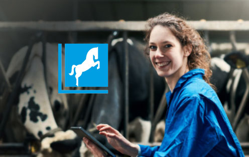
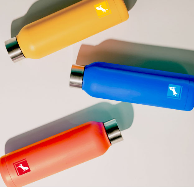
Colourful figurative mark
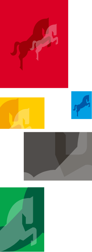
The colour of the logo can be varied for communication purposes. This optional multi-colouring offers more freedom of expression and connectivity. The following applies to their use: Harmonious with the dominant or accentuating colour ("tone-on-tone"). The colours do not serve to code for themes, products, or company divisions.
Read moreminimize
„As a company, we have started out on the right path and are taking on the challenges of the future.“
– Dr. Thomas Perkmann, CEO of the Westfalen Group
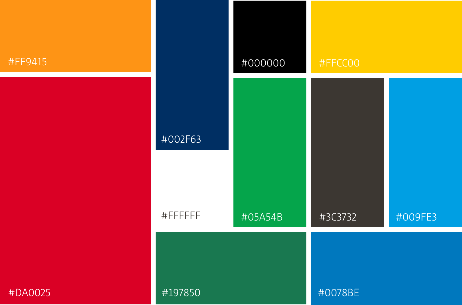
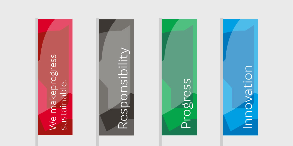
Colours
The brand colour is red. Red stands for "hazardous substances," but also for "lifeblood" - in other words, for the expertise and joy with which Westfalen approaches things. The design colours stand for the diversity of topics and solutions.
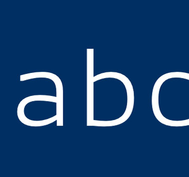
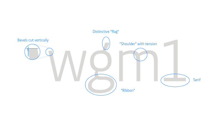
Font
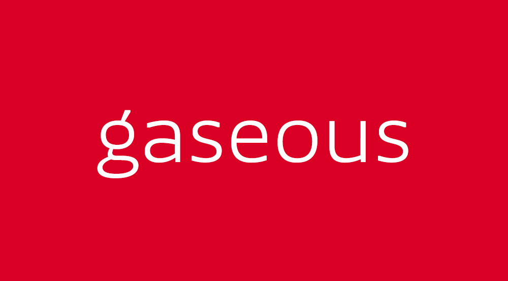
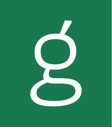
The new brand font is called Westfalen NewsSans. The precision, lightness and openness of the characters, as well as special typographic details, give the messages an independent, modern character. In particular, the small 'g' characterises many of the terms that make up Westfalen - for example, gaseous, gas, digital, ...
Design elements
The horse from the figurative mark is the essential identifying feature. The horse is therefore also used as a design element - solitary, as a group of two or three. The combination with colour and type creates striking brand typography.
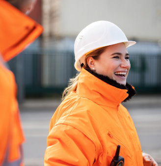
Visual imagery
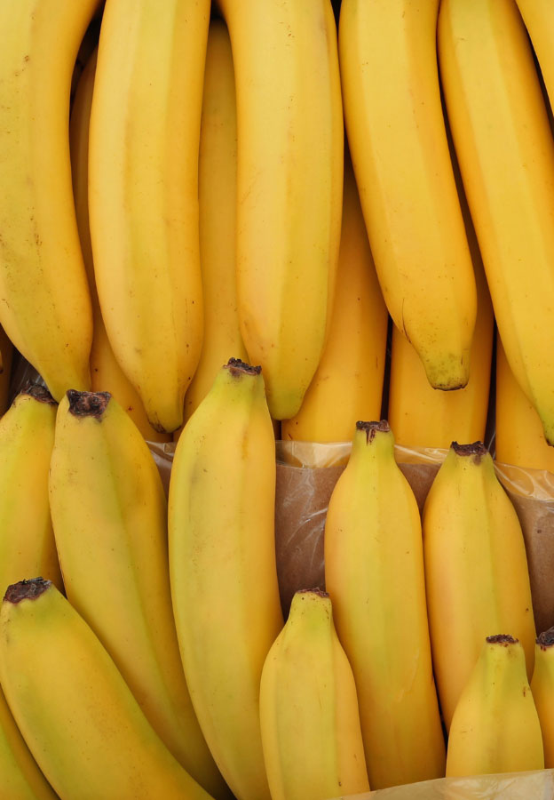
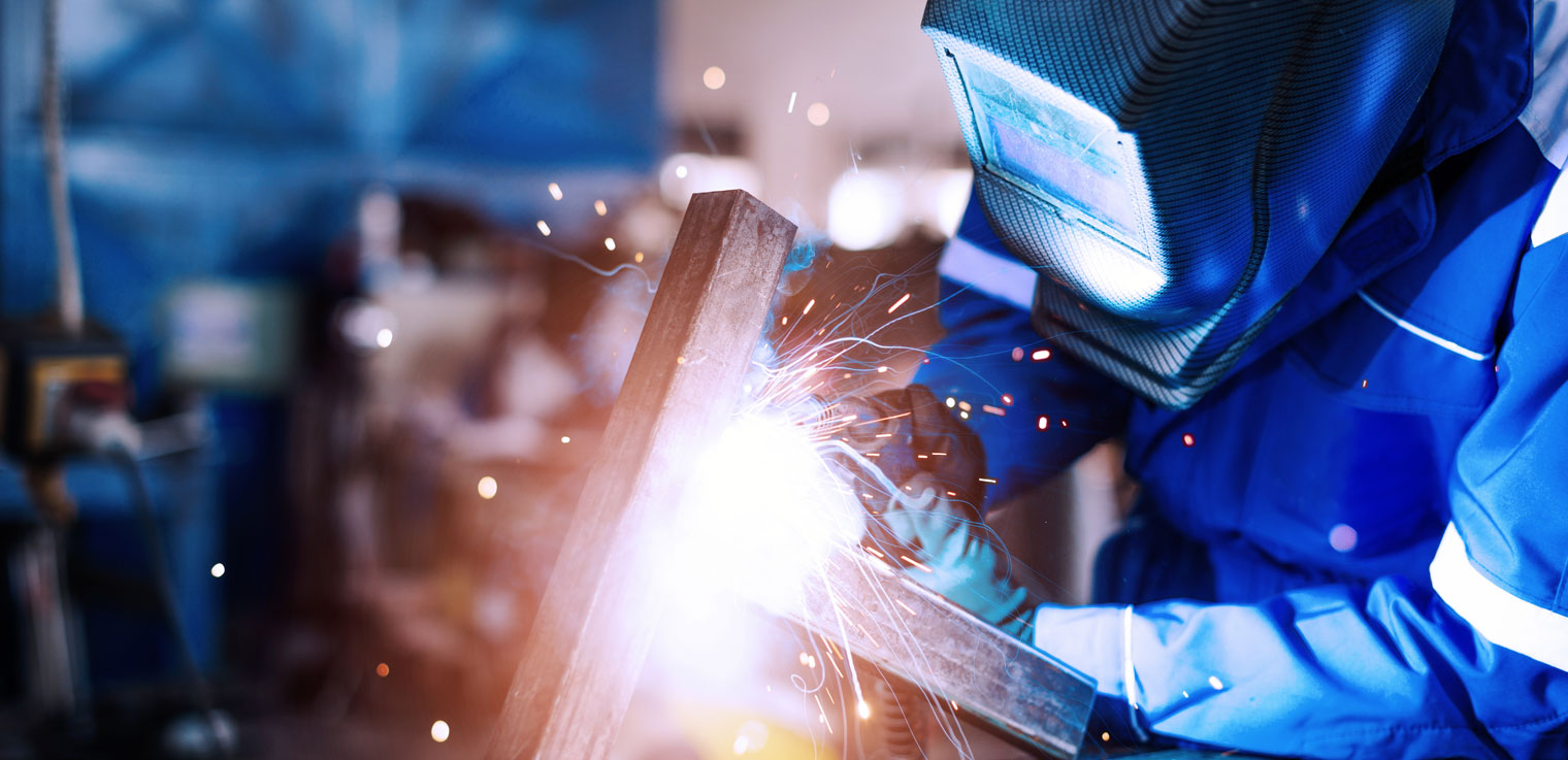
The new visual imagery is focused, striking and activating. It relies on authentic shots by showing real use cases and the company's own employees. The powerful colours attract attention and harmonise with the chosen colour spectrum. Hereby, the colourful image brand can become part of the story.
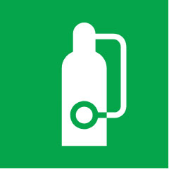
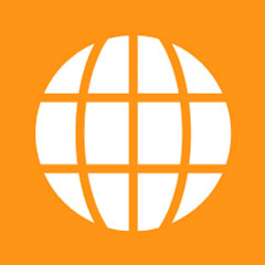
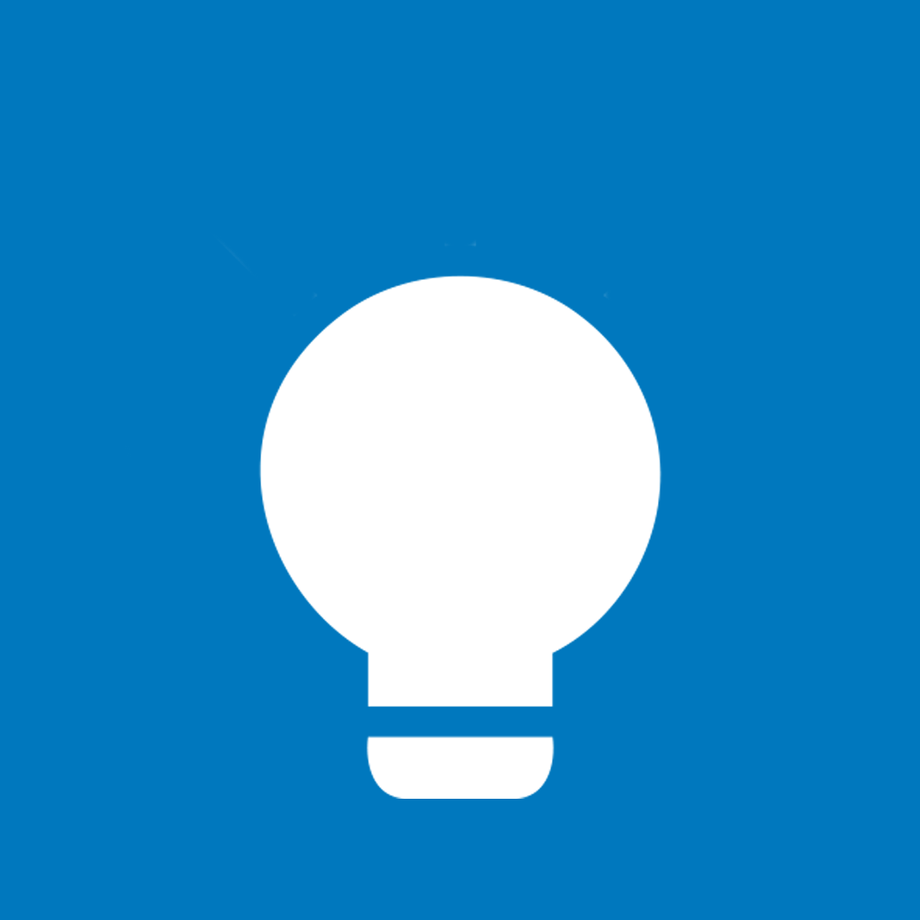
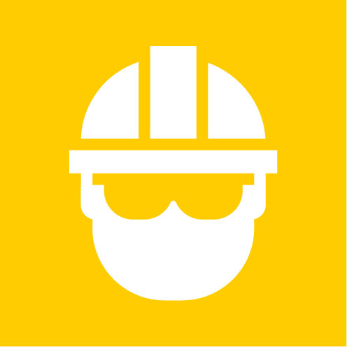
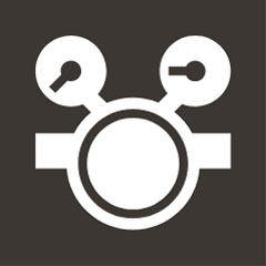
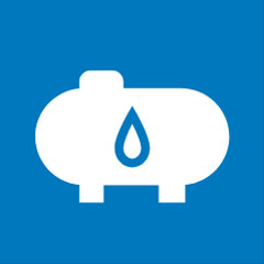
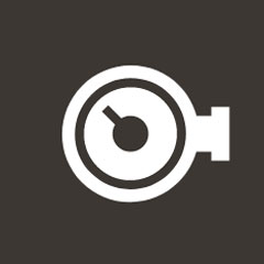
Pictograms
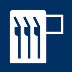
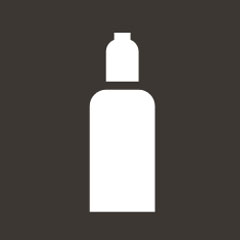
Icons and pictograms support the perception of the brand as a "solution provider". They stand for functionalities or characteristics of Westfalen's products and services. The design style is inspired by the figurative mark - the square, flat basic shape, angular and round edges, positive and negative lines.
Infographics
Infographics can be used to illustrate the significance of figures and data in a brand-defining way. Together with diagrams and technical drawings, the perception of competence as an innovative solution provider is underlined.
„Modernisation creates new scopes for design - especially for digital channels.“
- Maren Rose, Head of Marketing, Communications & Sustainability
Application
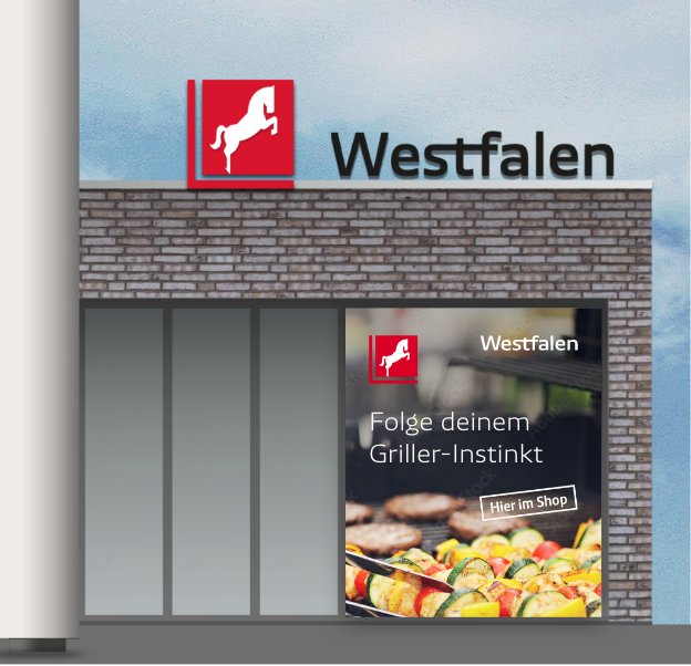
Annual report
The new design has already been applied in the annual report for 2021. Let the new brand design convince you.
Annual Report 2021Frequently asked questions
Why has the Westfalen Group revised its brand identity?
Going much further instead of keeping it up
We are making progress sustainable - this is the central message of the Westfalen brand mission statement. This claim places demands on brand design, modern brand communication
and prudent implementation planning. Three goals are being pursued:
- to become clearer - the recognisability is to be strengthened by focusing on the essential characteristics: above all on the horse and the red. This has been the hallmark of Westfalen for around 100 years.
- leap further - the possibilities of expression, especially for digital communication, are to be expanded. This means: more flexibility and leeway in dealing with the brand elements
- thinking sustainably - the transition is to be designed in a compatible way. Therefore, the design was developed in such a way that old and new can exist simultaneously during implementation.
When should the changeover to the new design take place?
The changeover is to be implemented step by step using a cost-optimised, resource-conserving approach. The annual report 2021 was the first medium to be published in the new design at the end of June 2022. Other digital touchpoints and print media were already converted in some cases in 2022, others will follow in 2023. In 2023 the website will appear in the new design and structure. The change in the subsidiaries and national companies will also take place from 2023.
Will all petrol stations be converted to the new design?
The existing petrol stations will remain in their familiar appearance. New buildings, such as the mobility hubs, will be implemented in the new design. When developing the new brand identity, care was taken to ensure that the old and new brand worlds function in parallel.
Do you have any suggestions or further questions?
Then please feel free to contact us at digital-marketing@westfalen.com.